
Partner Story
Relay repositions their messaging.
The challenge
Feed technology pioneers
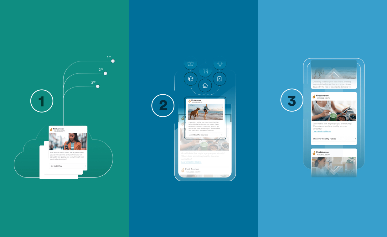
Relay Network are the feed technology pioneers. Relay’s feeds harness the engagement power of social and news feeds for businesses and the people they serve. Additionally their technology is the first secure format for engagement with out-of-the-box content proven to build lasting customer relationships.
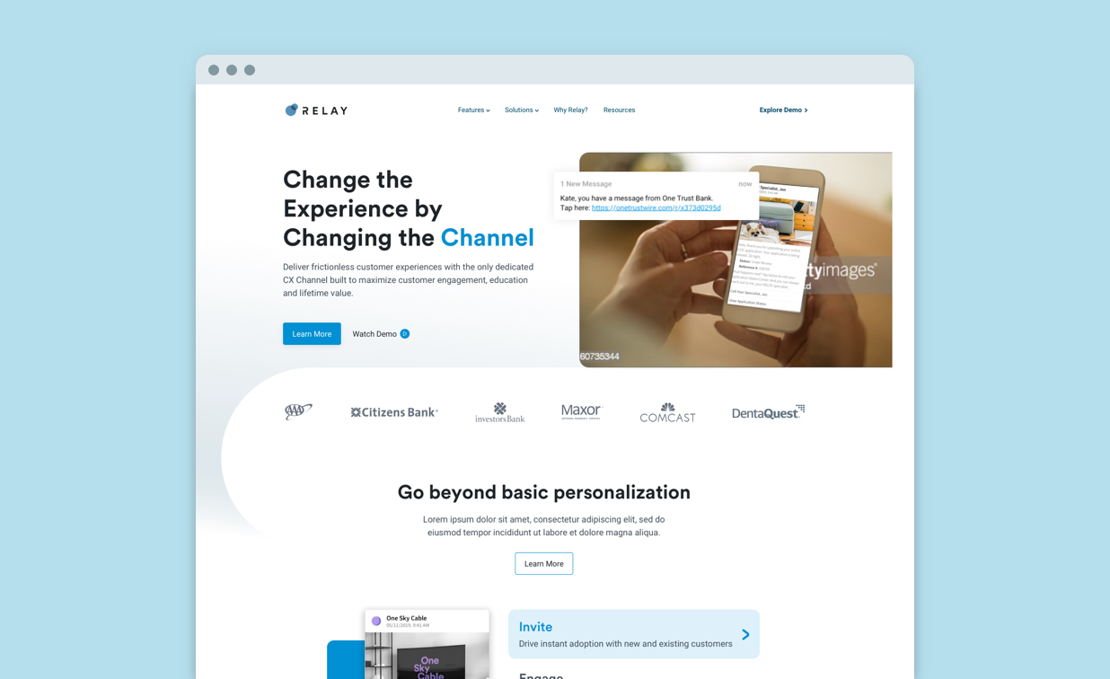
Relay Network came to us with a few problems that they needed help solving starting with a need to reposition and refresh their messaging. Relay solves the customer engagement problem by providing a SaaS platform that enables businesses to meaningfully engage with their customers – but their previous website wasn’t telling this story properly.
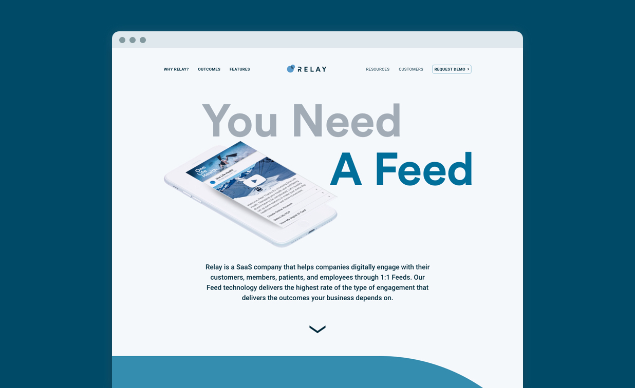
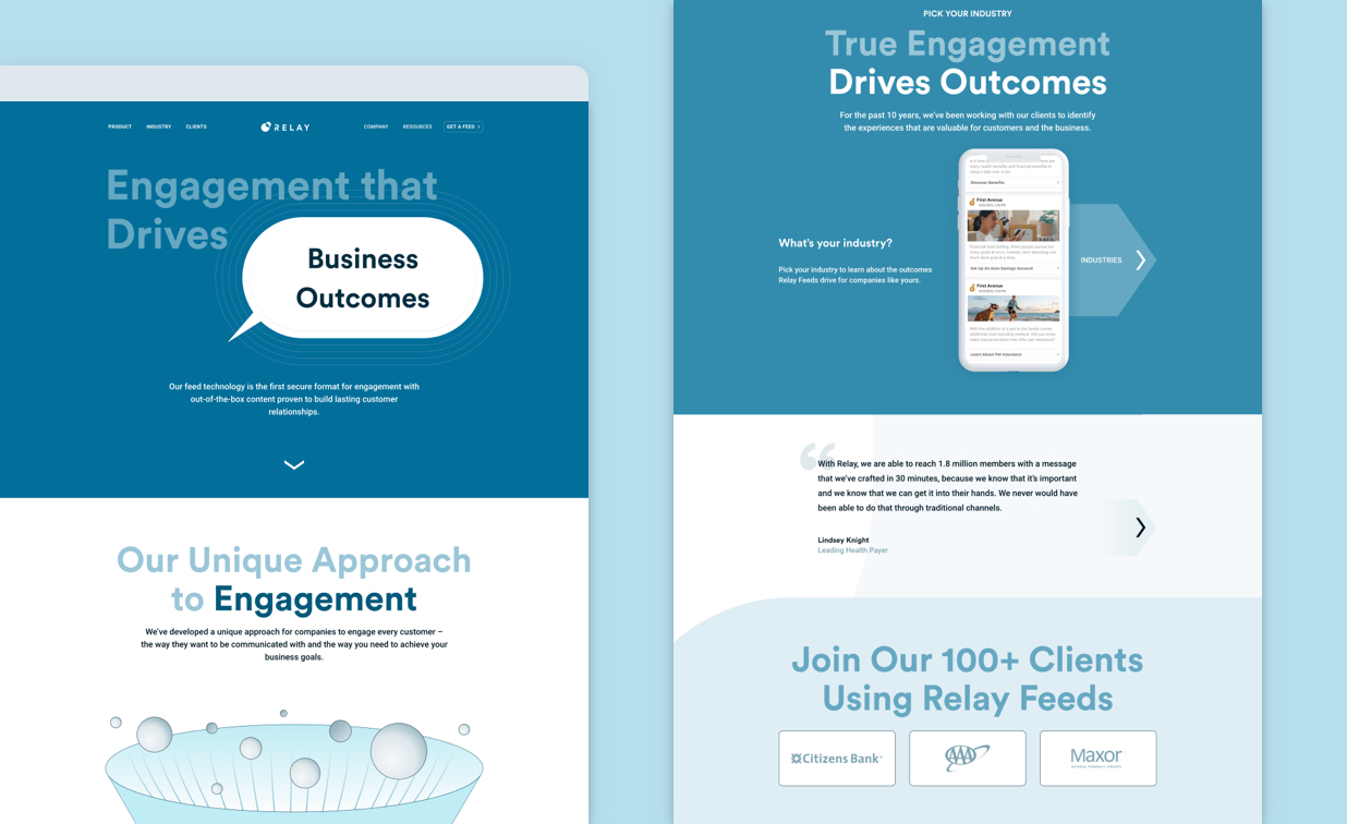
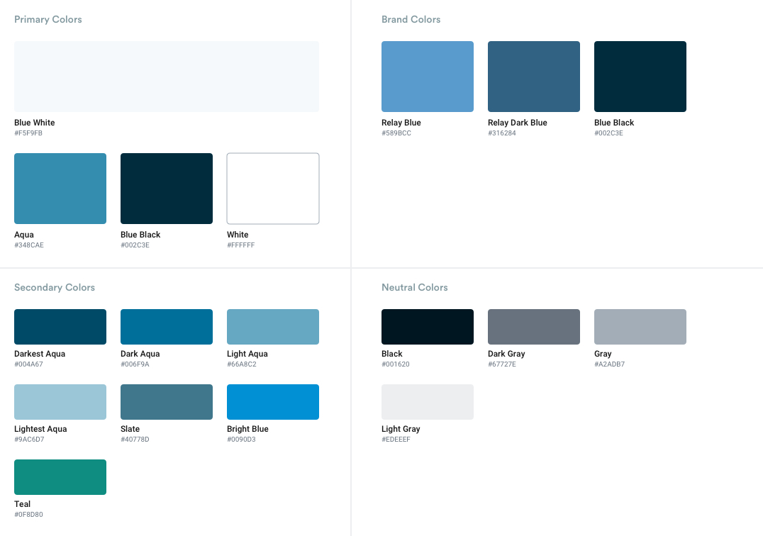
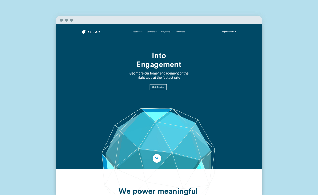
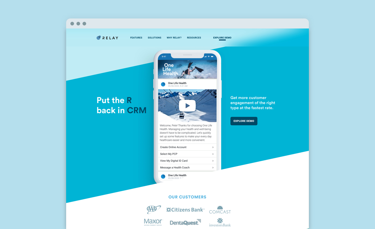
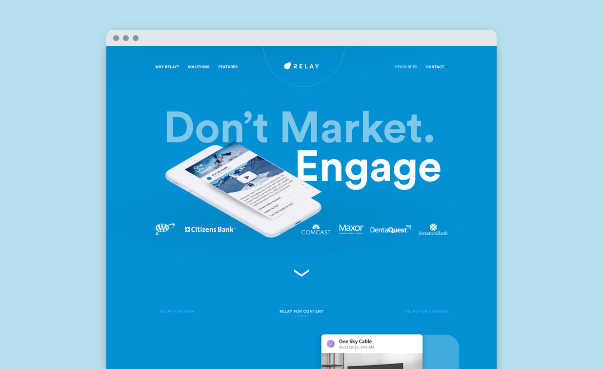
To compliment updated messaging, the Relay team also wanted a new look and feel for the site. The team wanted to step outside of the box and do something different and not often seen in the engagement space. They wanted to use big bold fonts and lots of colors. They wanted to incorporate movement, animation, and custom graphical elements to help bring the new site to life.
Another goal for the Relay team was to build the new site on a CMS that was easily manageable and updateable by the marketing team. Their previous website was built on a platform that was unable to be managed by their marketing team and simple content updates required support from the Engineering team. Relay needed a site that not only looked great but was fast, intuitive, and easy to update.
The final goal of this redesign was lead conversion and increased site traffic and engagement. The Relay team’s ultimate goal was to drive visitors to watch a demo or contact Relay to help accelerate anonymous visitors through their buyer journey.
I’ve been fortunate enough to collaborate with Flickerbox, Inc. in building amazing sites at four different companies throughout my career so far, and each time they have pushed the envelope and delivered something amazing – but this latest site we’ve just launched for Relay Network is on a whole new level.
Tal Klein
CMO, Relay

The process
An eye for engagement
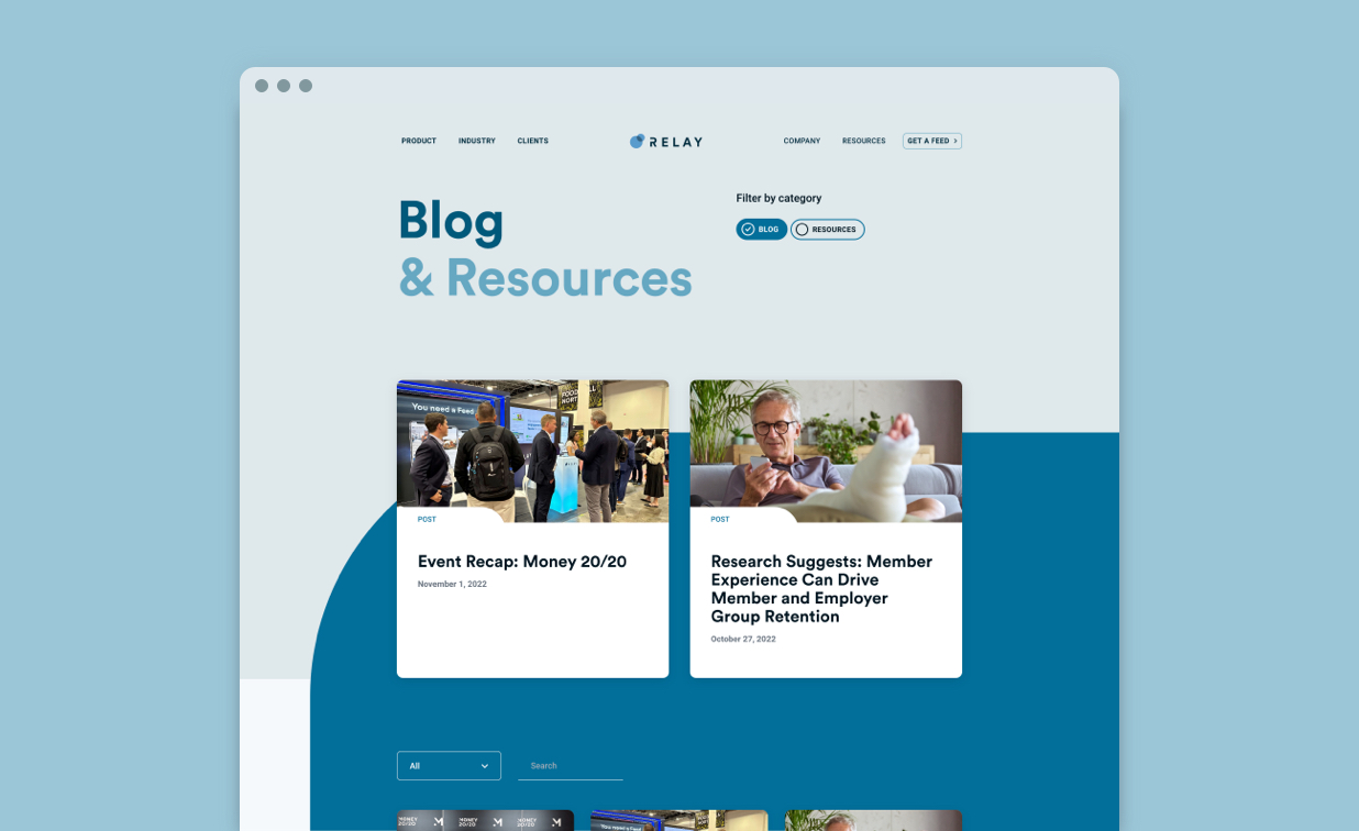
We started this partnership by focusing on the updated messaging and positioning piece. We worked together with the Relay team to identify key customers and their user paths through existing and planned content towards engagement and lead capture. We helped update and refresh the messaging to present clear and simple value statements that help visitors understand and connect with the solutions and differentiators that Relay provides. With updated pathing and messaging in place we developed an information architecture that distilled down the content buckets into a structure that was easier to digest and more intuitive for visitors.
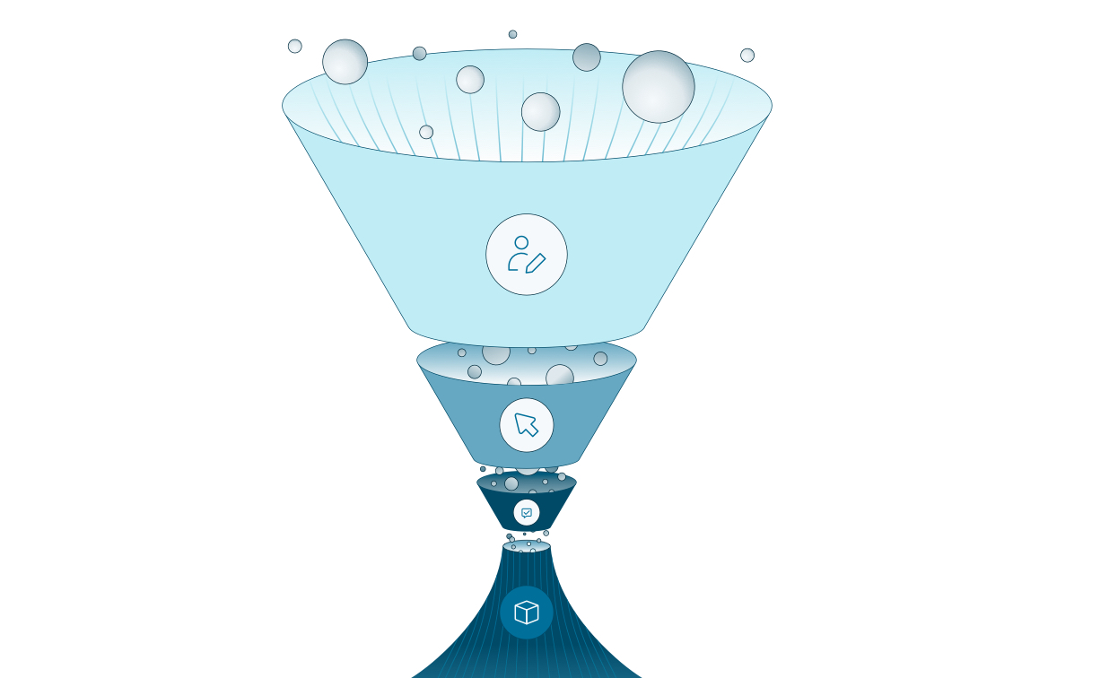
Following the positioning work, we worked with the Relay team to bring to life the stakeholder’s vision of designing a new in-page “navigation style” that evoked the power of customer feeds without being too on the nose. This new navigation style needed to take visitors on a side scrolling content journey as well as encouraging visitors to continue reading down the page. We started the visual design piece with wireframes and moved through static color comps for all key pages. In addition to the static comps, the Relay team really wanted this site to feel alive. This was accomplished through several animations that helped tell the story of Relay’s Feeds.
Based on the marketing needs for a self service website, Flickerbox crafted a custom Gutenberg based publishing experience that has enabled Relay to break free from the fixed confines of their legacy system. This improved workflow is as dynamic and flexible as the marketing team while reducing the learning curve and being more user friendly than their previous platform.
Bonus round
The UI interactions and animations capture the essence of Relay’s services. Just as their software seamlessly harnesses user engagement, our animations mirror the fluidity and simplicity of using their platform. With each frame, we’ve crafted an immersive experience that effortlessly guides users through the intricate world of feed management. These animations don’t just visually enhance the website; they embody the essence of 
