
Partner Story
RSA Link develops a new community.
The challenge
An opportunity to redesign and restructure
RSA.com had recently done a site redesign but their community site, RSALink, had fallen out of step. As they were planning on switching platforms for their community, they decided to use the opportunity to redesign the community site, not just visually, but also from a content access perspective. They had an internal development team to work with, but needed guidance and direction with the design and structure of the site.
This presented us with three main goals:
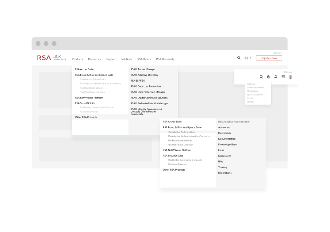
- Create a new architecture for the site that would allow the visitor to consume the content along the product line
- Design the Community site to be in-family with RSA.com, while still creating its own identity
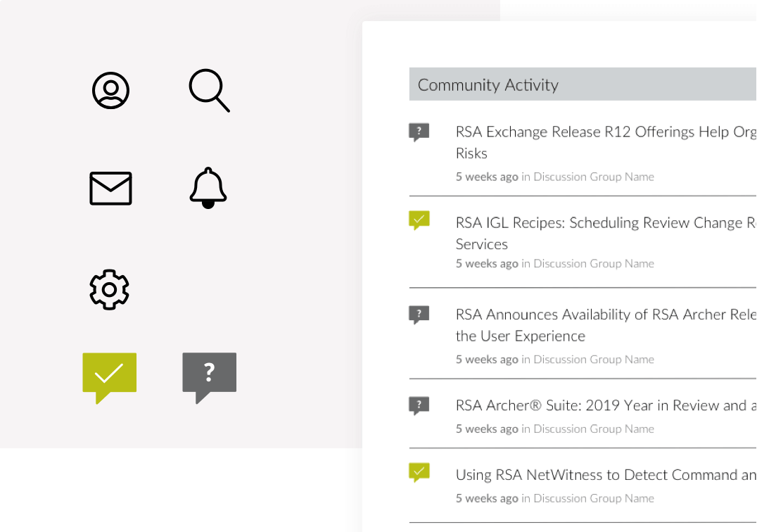
- Accommodate new functionality available on the new platform.

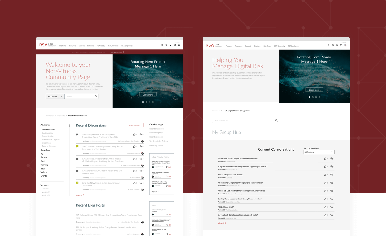
It was a pleasure working with you and your expertise really shined through the project.
Brayden Green
Lead Developer
Team Link, RSA
The process
Design driven by information architecture
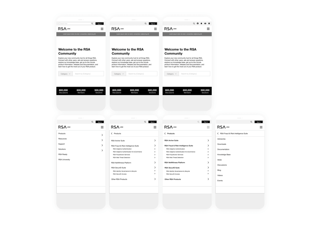
We took them through a user path and content flow exercise in an effort to help determine the best way to organize the content. We built up a new information architecture to reflect what we were proposing and to show them how the new structure met their objectives.
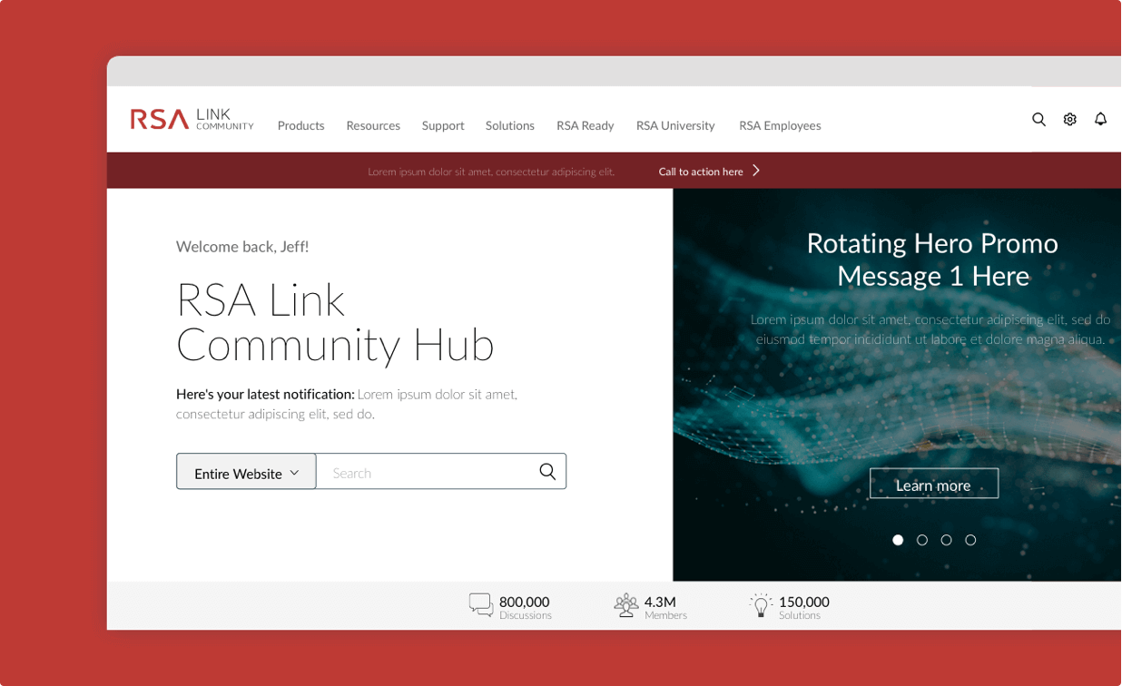
Once we had the structure down, we began working on the design of the homepage. We drew on the styleguide that was developed with the RSA.com redesign. In addition to the fundamental design, we had to consider the functionality of the new platform. We developed content types and organization of that content based on whether the visitor was a user and what level user they were.
For the product section we needed not only to consider which role the visitor had in the community, we also needed to consider what we knew about which products they owned. This allowed us to design a more tailored experience for the visitor, focusing on content and making sure its presentation was as relevant as it could be.
The result
A clear identity, focused on content
All in all, we better organized the site to reflect the product offering, we delivered 6 design comps which formed the building blocks for whole site build out, we developed a clear identity for RSALink and took full advantage of the platform’s ability to identify the user and their role, serving up content that best suited their journey.
- Responsive and mobile development
- Art direction
- Concept and creative
- UX/UI design